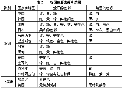
2 colors and countries. Different countries have a corresponding relationship to color (Table 2), especially related to national flags, religious beliefs, and so on. Prepress designers need to consider the color preferences of the corresponding countries when selecting colors, whether there is a conflict of religious beliefs, and try their best. Of course, social culture and science and technology are constantly improving, and the preferences of different countries for color will change over time.
3) Internet image processing
Currently there are two common Internet image formats: JPEG and GIF. Resolution is a very important concept in printing images. The size of the resolution directly affects the print quality. In Internet images, the resolution value is ignored and no longer works. No matter how much resolution you set for the image, the web browser will display the image pixels in one-to-one correspondence with the screen pixels (unless the web designer The additional image size is set in the HTML file). Therefore, the resolution of the image is actually equivalent to the resolution of the screen, and the resolution of the screen cannot meet the general printing needs. In this case, when the pre-press design needs to print and copy the images downloaded (or saved) from the Internet, the resolution and size of these images must be properly adjusted so that they can be finally used for printing. The general adjustment principle is to change the resolution of the image to a suitable size when the size changes little, enlarge the image to observe the pixel clarity of the edge of the image, and judge whether the image meets the printing needs according to designer experience.
4) Digital Camera Image Processing
Digital cameras can basically be divided into ordinary and professional types. The resolution of professional digital cameras is very high, there is no problem with the image quality, which can meet the printing requirements. However, the image of an ordinary digital camera may not necessarily meet the printing requirements, and it is necessary to check the resolution of the image.
5) Design color mode
In image processing software, the image is processed as much as possible in RGB color mode, which ensures that all filters can be used. When the image processing is completed, the RGB color mode is converted to the CMYK color mode before being introduced into a vector processing software such as CorelDRAW, and it is necessary to ensure that the black text does not contain color components.
6) Color space
In the prepress design, we usually talk about the most color mode, such as RGB, CMYK, Lab, etc., corresponding to the different color space, or called the color space. We edit images in a certain gamut space. The color gamut refers to the range of colors represented by the number of colors that can be expressed in the color mode, as well as the range of colors that can be represented by a specific medium such as a computer screen display, printer output, and print copy. In the color mode, Lab has the largest color space, including RGB and CMYK color space. The RGB color space represents the set of colors that can be represented by the color light table color method, and the CMYK color space refers to the color set represented by the color material. The RGB color space is larger than the CMYK color space. This is also one of the reasons why WYSIWYG cannot be realized.
When it comes to gamut space, there are several concepts to be aware of: disabled colors and color warnings.
The disabled colors include fluorescent colors, special reds, and high-bright yellows. These colors have exceeded the CMYK four-color color gamut, and can only be approximated with CMYK. Therefore, try to avoid using these colors in prepress design. The concept related to disabling color is "color warning". In Photoshop, there is a "color warning" function. When a designer selects a color or performs color processing on an image, the color warning function should be turned on to ensure that the color is in the four-color color space. The simple operation is as follows: Under the "Display" menu, select "Gamut Warning" or press Shift+Ctrl+Y directly.
7) Image Reduction Techniques
A basic principle of image reduction without affecting image quality is to scale to integers for program sampling. If you zoom in at a ratio of 1/2, 4, 1, and 8, you can maintain the sharpness of the image. If the original image size is odd or even prime, you can do a little trimming first. It is better to make the edge length be 2 times the Nth power, at least even, and then zoom out as described above.
8) The color of the shadow
Shadows for objects or texts in pre-press graphic design are generally selected in the image processing software Photoshop, because the shadows created in Photoshop software have a certain virtual edge, and there is no such effect in the vector processing software. In the choice of shadow gray, generally choose four-color gray, four-color gray shadow visually better, relatively soft, no "hard edge."
9) Font Design and Checking In pre-press graphic design, choosing an attractive font can have a multiplier effect on the design effect, but it is best to use commonly used fonts, such as fonts from Founder, Wending, and Hanyi fonts. If you need to use a certain font font in the design, this font is not in common font fonts, before the completion of the design, in the vector graphics processing software CorelDRAW and Illustrator to first convert the text to the outline (outline) mode, Avoid problems that cannot be output because the output center does not have such a font. If you have a make-up file in your work, you must copy the make-up file.
When text typesetting is performed in software based on vector graphics, it is often necessary to highlight some texts. When the designer directly uses the text thickening options provided by the software, the screen “seeing†and the print “gain†will not match. The problem is that when the text is displayed on the screen, the text is bold, but the printing effect is completely different. The bold text on the screen forms a shadow or a paste, especially if the text size is particularly small. For the case that the text needs to be bold, the designer should choose the bold text to ensure that the layout is basically the same.
10) Four-color black and monochrome black
Prepress design In Photoshop, when processing the text of the text part, when converting from RGB color mode to CMYK color mode, the original set black and white color must be changed to four-color black. At this time, the color of the font should be reset. The text of the four-color black (C100 M100 Y100 K100) is changed to monochrome black (CO MO YO Kl00). In addition there are two things to note:
1 When you first create photos in Photoshop, black text should be selected as Multiply. You cannot select Normal or Screen. If you do not find it, you must manually change it.
2 When outputting a PS file from PageMaker or Corel DRAW, note that the black option is overprinting, not overprinting.
Source: "Printing World"
Author: Wang Chaoyang Communication Department of Journalism and Communication, Wuhan University Network
Softside Luggage is constructed of lightweight and durable tear-resistant fabrication, the set is perfect for all of your travel needs. Go on your next adventure with the filament collection from softside luggage! the lightweight spinner brings style and storage for an overnight trip or lengthy journey! A strong, lightweight, telescopic handle system - giving you superior control when on the move. Easy-grab top & side handles - convenient for lifting! each case is fully lined & includes a zippered mesh pocket and 2 tie-down straps - perfect for keeping your belongings organized and secure. Silent spinner wheels allow you to quickly maneuver in tight spaces and provide effortless movement.
Softside Luggage
Softside Luggage,Spinner SoftSide Luggage,Soft Sided Luggage Sets,Softside Wheeled Luggage
Jiangxi Jizhirui Luggage CO.,Ltd. , http://www.feybaul.com